It's high time to nest and get the baby prepping underway in the apartment. Since it has been way too stressful to fantasize that we might live in a different place, or we might move back to Bremerton or we might just have a second bedroom for a nursery, we have decided to act as if we will be staying put. That makes me feel a little bit better, but now we have a major design and organizing challenge to face. The fact is that the two of us and the cats fit in here snugly, but contentedly, and that the baby will be no small addition.
The idea of this seemingly impossible task has really got my wheels spinning. This is a good thing, since I've been at a complete standstill for months on end. My goal now, is to prove that it can be done. A little family can live in the city in a one bedroom apartment with one closet and be happy, organized, and have a beautiful space. Breaking this feat down into doable projects, I will detail the process of sorting our belongings, creating storage where there was none, carving a nursery out of a corner in our bedroom, and making it all look good to boot.
The first thing on my list is to scrutinize every piece of furniture. Is it serving a purpose, could it be more useful, could we do better with something different?
Take for instance what I refer to as my work space. The pedestal table I scored last year at the Bainbridge Island Rotary Sale for $20.

It is a great table, no doubt. But, it just gets stacked upon, has no drawers for bills, and desk-y supplies, and it's not comfortable to sit at. The verdict: time to move it to storage. What I am looking for in its place is a real desk. I am thinking knee-hole with drawers on each side. I want used and I want it cheap. This does not mean I am willing to compromise on quality. As for looks, as long as it has good bones, I'll paint it if need be, and change out the hardware.
This is just an example of how I am looking at everything with fresh eyes in my attempt to streamline, declutter and make the place more baby friendly. Similar statements can be made about most pieces in the apartment right now. It just won't work to bring a baby home as things are right now, so we are are going to have to make some changes. And I am very much okay with that! It's good to finally have a project with some depth, vision and importance.
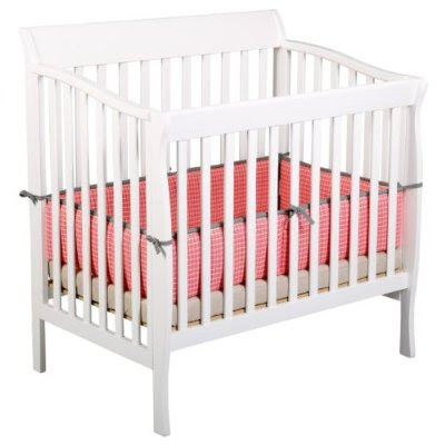
Totally off topic, and just to show you something fun and cute, here are some of the fabrics that will be used for the baby's crib bedding and the quilt that my mom is making. From Michael Miller's Lagoon collection, found on
hawthornethreads.com:


Isn't this going to be a fantastic adventure!